Lethbridge Roller Derby Guild
An 8+ open roller derby league. Home of the Deathbridge City Rollers and Windy City Wipeouts.
We can’t wait for you to join us!
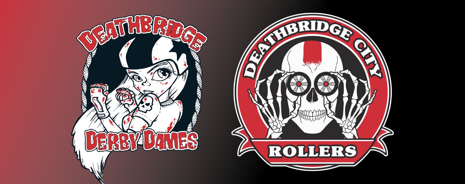
Roller derby is a young sport. With the incredible diversity of players that decide to lace up skates and join the pack, it is vital to have a team identity that everyone can connect to. In Lethbridge, we bring in new skaters every year that are not represented accurately as ‘Derby Dames.’ Therefore, the Lethbridge Roller Derby Guild decided we needed a new brand to affirm our commitment to an open-gender adult team.
After reaching out to the team for input, the initial sketch of the selected logo came about in trying to find a balance between the Deathbridge identity and the fun of the sport. As our in-house artist, Pink Flay’d, was fine-tuning the design, they felt it was important to include elements used by our co-ed junior team – the iconic bridge structure, the banner, and the overall shape.
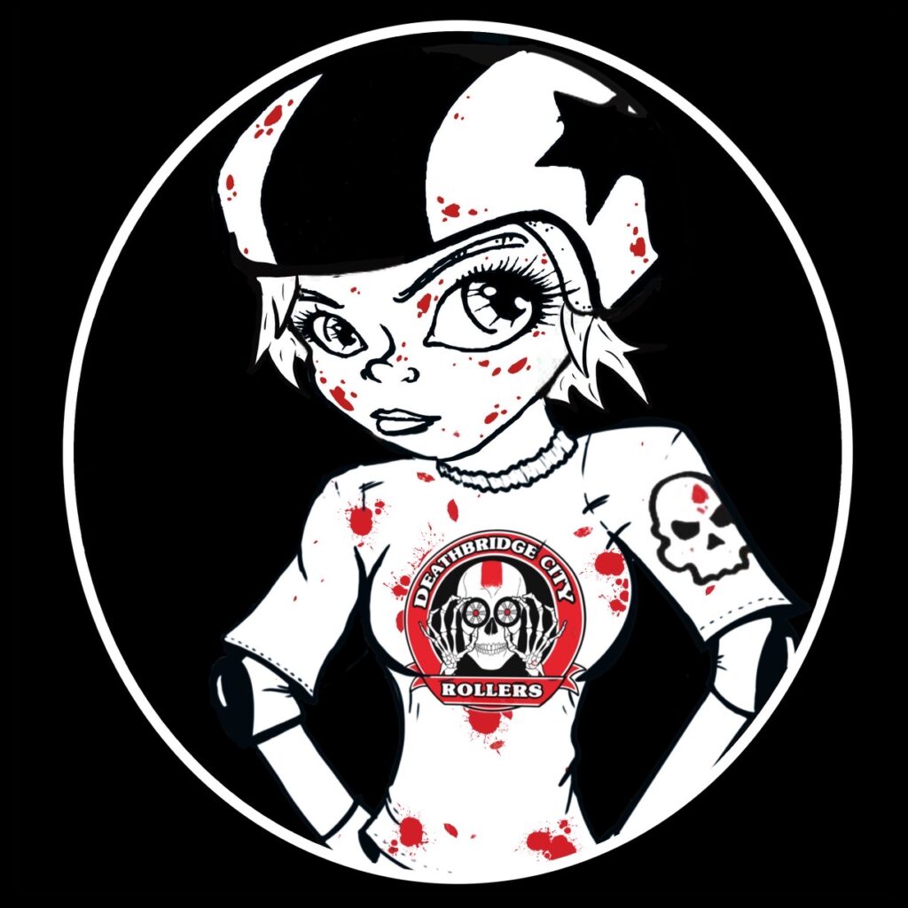
Our in-house digital animator, Flynch, added extra spice by adding animation and giving Dame her new jersery for the brand launch.
Essentially, it’s like a grown-up version of the Windy City Wipeouts logo. Our juniors are an incredibly talented bunch of skaters that we’re excited to have with us on the adult team when they’re ready. We want to be sure they’ll be joining a team with an identity that represents them authentically.
The Deathbridge City Rollers will see you on the track!
LRDG rebranding committee